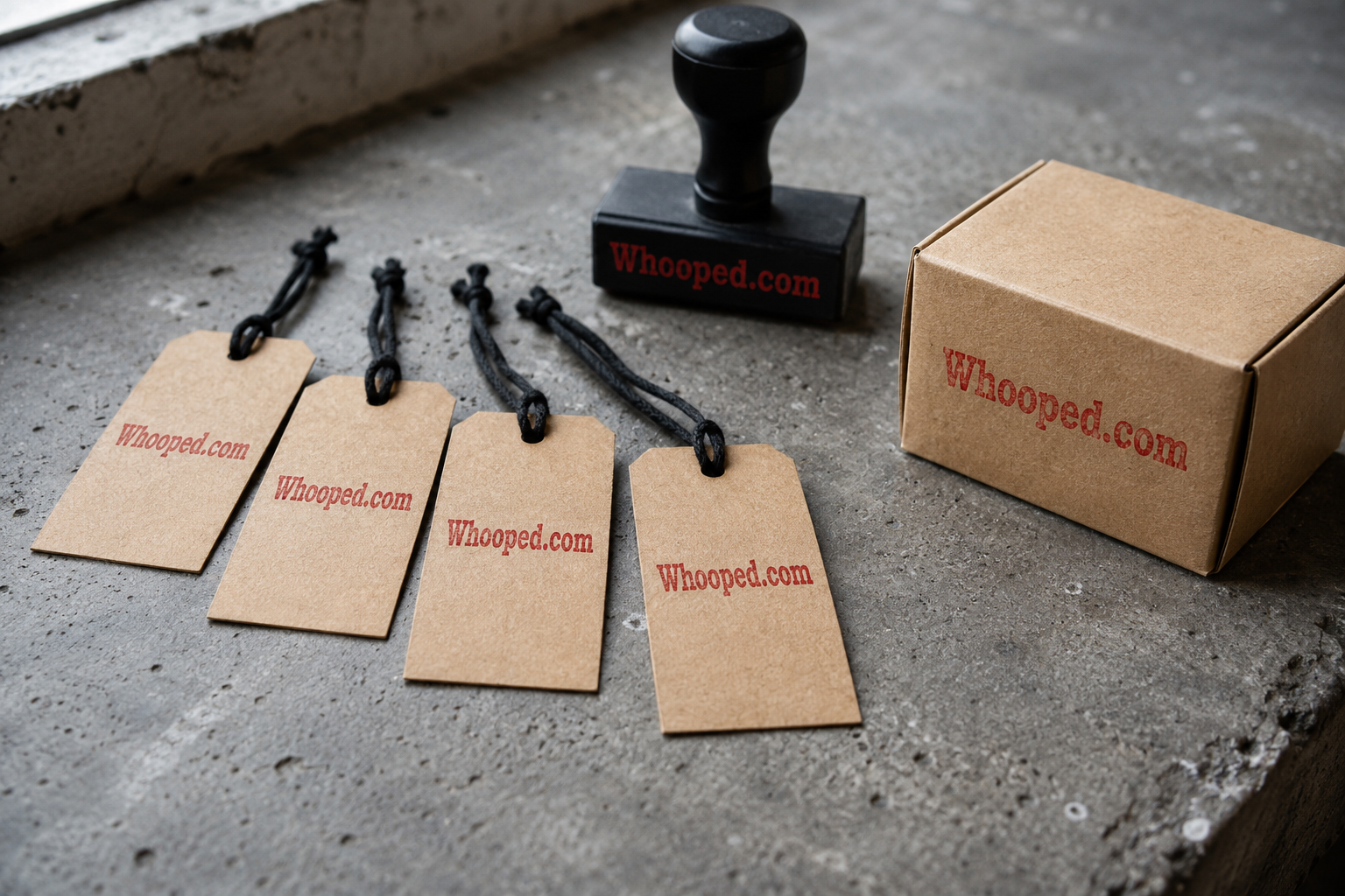
I can picture Whooped on objects because the word behaves like a stamp. It is short enough for a woven label, a small enamel mark, a box edge, or the face of a simple product. It already has motion, which gives a maker something to work with before an illustration or slogan arrives. The line could begin with clothing, desk objects, printed matter, or another focused collection while the name stays broad enough to travel.
A goods name needs to survive contact with material. The word should remain legible when it is stitched, embossed, etched, or printed at modest size. Whooped has a distinctive silhouette and a familiar spelling. Editorial coverage at The Business of Fashion regularly shows how a label becomes valuable through a combination of product discipline, distribution, and cultural clarity.
Start with one recognizable object
I would give the line a narrow opening collection. One excellent object teaches the audience how to read the name. Its material, price position, photography, and packaging establish expectations that later products can inherit. A broad launch makes that lesson harder because the buyer has too many signals to sort. Focus turns the first object into a definition.
The voice could be confident and slightly dry, allowing the energy of the word to do the expressive work. A bright consumer treatment is also possible, but the choice should reflect the actual customer. Publications such as Highsnobiety reveal how products gain meaning through context, while Vogue Business follows the commercial systems required to sustain that meaning.
A label people can repeat
Physical products move through recommendations. A customer sees an object, asks about it, and carries the answer into another conversation. That is where a spoken word earns its keep. Whooped can be delivered quickly, and the matching address is a natural destination. The label does not need a category word attached every time the product changes.
I would protect that simplicity in the product naming system. Individual pieces can use numbers, materials, or concise descriptive titles. The master mark remains Whooped. Trade reporting from WWD provides a steady view of how labels expand, collaborate, and enter new channels while trying to preserve recognition.
The right maker
This direction belongs to a creator who cares about the object before the campaign. The name can attract attention, but the product has to reward it. Careful material choices, consistent fulfillment, and a recognizable photographic language would turn the word from an interesting label into a trusted signature. The compact .com can then hold the catalog, story, and customer relationship in one place.
Putting the name through ordinary tests
A useful name must leave the presentation and enter daily life. Say it in an introduction, place it in a sentence of recommendation, and ask another person to type it after hearing it once. Set it in a small browser tab, a plain invoice, and a large sign. These exercises expose friction that a polished logo can conceal. They also show whether the word has enough shape to remain recognizable when the design system changes.
The phone test is especially revealing. A listener should catch the rhythm and have a fair chance of finding the spelling. The memory test comes next: return to the name a day later and see which part survived. A good result does not require universal taste. It requires a distinct verbal form, a manageable spelling burden, and a tone that can support the intended audience.
Building meaning through use
A brand name gathers meaning from repeated conduct. Product quality, service, editorial choices, packaging, and public language gradually attach associations to the word. That is why a broad name can be valuable. It begins with enough character to earn attention, then gives the company room to define what the attention means. Consistency does the patient work that a naming explanation cannot.
The first identity should make one strong decision rather than ten decorative ones. Choose a type voice, a compact color system, and a clear rule for how the name appears. Then place it in the situations customers will actually encounter. The goal is recognition across contexts, from a social avatar to a receipt to the spoken close of a recording. Repetition builds the bridge between an unfamiliar offer and a familiar mark.
Document the final choice in plain language. Record the preferred capitalization, pronunciation, domain, short description, and examples of correct use. This small reference keeps a growing team consistent when new pages, products, and campaigns appear. It also gives outside designers and writers a dependable starting point. Brand recognition often grows through hundreds of modest decisions, so a useful standard is more valuable than a complicated rulebook nobody consults.
Revisit the system after customers have used it. Real questions and mistakes show where guidance needs to become clearer.